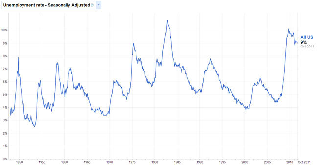
I’ve been watching the unemployment rate drop and wonder what the cause of it might be. Could be the seasonal jobs or that the economy is really picking up. The current unemployment rate is 8.9%.
At the same time, I’ve been reading articles on how to interview and how to make a resume. There’s a little trend on making resumes that I find interesting. The trend is to make your resume fancy with a bunch of pictures and a trendy layout. I did this about 12 years ago. I had a “traditional” resume and then on the side were graphics of things that relate to the job: computers, servers, webpages, etc… It was frowned upon.
Today, we’re seeing more resumes out there that do not follow the traditional styles. The new, trendy, funky layout resumes that companies like LinkedIn and Monster are showing are cool…but if dig deeper into them, these resumes are made by those in the graphic design/marketing industries.
I decided to jump in and make one. Here it is: Edel Fancy Resume
I like to call this style Resume 2.0 after Web 2.0. My fancy resume models my website. I guess the idea is to make a business card that matches the resume so I have a complete package: resume, website, and business cards. The clean look of this resume is easier on the eyes because you don’t have to wander too far to get information.
Let me know what you think about these new style resumes…well, old style for me but are now acceptable by the public.


